
404 Page Examples That Help Lost Visitors Recover
Vincent
31/07/2023
32
404 page examples show how a website helps visitors recover when a URL is missing. In 2026, marketers and SEO teams should review these pages by user path, page priority, status code etc., especially after URL changes or an HTTP to HTTPS redirect, so broken URLs create less confusion and fewer lost leads.
What is a 404 page?
A 404 page appears when a visitor requests a URL the server cannot find. MDN defines the 404 Not Found response as a client error status that means the requested resource is missing on the server. If the resource has been removed permanently, MDN recommends using 410 Gone instead.
This error can happen after a page is deleted, a URL changes, or a visitor types the wrong address. Website migrations also create 404 issues when old paths lose their matching redirects. In each case, the visitor reaches a dead path while the site still has a chance to guide them somewhere useful.
The best 404 page examples solve that moment with two layers. The first layer is user experience: a clear message and a useful recovery route. The second layer is technical accuracy: the server response must match the real page condition.
Why 404 page examples matter for UX and SEO
A strong 404 page can reduce the damage caused by a broken user journey. When someone lands on an unavailable URL, the page should explain what happened and offer a relevant next step. For high-priority templates such as pricing, service, product detail, checkout etc., that recovery path can affect lead quality or revenue.
Search engines also need a clear signal. Google has explained that soft 404 pages can confuse both users and search engines because the page looks unavailable while the server returns a 200 response code. Google recommends returning a real 404 response for missing URLs, with a helpful message for users.
That is why design alone cannot carry a 404 page. A clever illustration may make the page memorable, while the server response tells crawlers how to treat the URL. For SEO teams, both sides should be reviewed before a redesign, CMS cleanup, or migration release.
What the best 404 page examples include
The best 404 page examples feel simple because the recovery path is obvious. Creative design can support the page, but the visitor still needs to understand the issue within seconds. On mobile, this clarity becomes even more important because visual space is limited.
| Element | Why it matters | Practical direction |
| Clear message | Reduces confusion | Explain that the page cannot be found |
| Brand tone | Keeps trust intact | Match the site’s normal voice |
| Recovery route | Helps users continue | Offer homepage, search, category link etc. |
| Correct status | Gives crawlers the right signal | Return 404 or 410 when the page is gone |
| Mobile layout | Protects real user experience | Keep the main button visible early |
| Tracking | Helps teams find repeated issues | Monitor 404 visits in analytics or logs |
A good 404 page does not need to be complex. It needs to match the visitor’s intent, the affected template, and the value of the missing URL.
404 page examples by website type
Different websites need different 404 page patterns. A media brand can use humor because users often browse casually, while an ecommerce website needs fast product recovery. A B2B service page should usually guide visitors back to a commercial path.
| Website type | Example pattern | What to adapt |
| Entertainment | Disney, Pixar, Netflix etc. | Use familiar characters or story references |
| Ecommerce | Backcountry, Carwow, BigCommerce etc. | Add search, product categories, support path etc. |
| SaaS | Slack, Kinsta, Moz etc. | Guide users to product pages, docs, resources etc. |
| Publisher or blog | Medium-style layouts | Offer search and popular articles |
| Creative brand | Wendy’s, Dribbble, Mailchimp etc. | Use playful copy when the recovery option stays clear |
| Corporate site | Okta or Help Scout-style pages | Keep the page practical with a direct support route |
The key lesson is context. A visitor looking for a product needs a faster route than someone exploring a creative campaign page. When the affected URL has commercial value, the 404 page should protect the user path before it tries to be clever.
Simple 404 page examples
Simple 404 pages work well when visitors need fast recovery. This style often uses a short headline, a plain explanation, and one visible action. It fits SaaS platforms, service websites, knowledge bases etc.
A simple page can use copy like:
We could not find this page. Use search or return to our main resources.
That message gives context without blaming the user. The page can then show a search bar, a homepage button, or a link to the most useful section. For service websites, the best recovery option often depends on the page that broke. A missing blog post may lead to search, while a missing service URL may need a closer commercial destination.
Minimalist 404 design should still feel intentional. Spacing, typography, contrast, and button placement all affect whether the visitor sees the next step quickly. When the page is too plain, it may look unfinished. When the concept becomes too decorative, the recovery path can disappear.
Funny and branded 404 page examples
Funny 404 pages work when the brand voice already supports that tone. Pixar can use emotion because its audience recognizes the storytelling style. Wendy’s can use humor because the brand voice is already playful. Dribbble can lean into visual discovery because users visit the platform for creative work.
Humor should reduce frustration. It works best when the joke appears beside a clear way forward. A brand can use characters, mascots, campaign visuals etc., but the page still needs a visible button or search path.
For high-value URLs, creative copy should stay controlled. A broken pricing page, demo form, or checkout path creates a different user mindset from a missing campaign page. In those cases, the 404 page should move visitors toward the nearest useful destination before adding personality.
Interactive 404 page examples
Interactive 404 pages can make an error feel less frustrating. Some brands use small games, animated illustrations, moving objects etc. This approach can work well for creative portfolios, entertainment brands, or product teams with a strong design culture.
The risk appears when the interaction becomes heavier than the user path. A visitor who only wants to find a missing page may feel blocked by slow animation or hidden navigation. On mobile, large interactive elements can also push the main action too far down the screen.
Use interactive concepts when the affected template has low urgency. For checkout, support, account, pricing etc., the safer approach is fast recovery. The technical owner should also review performance because an error page can still affect user experience if it loads slowly.
Ecommerce 404 page examples
Ecommerce 404 pages should recover product intent quickly. When a product URL disappears, the visitor may still want the same category, brand, size, price range etc. A generic homepage button wastes that intent.
A better ecommerce 404 page gives shoppers a practical next step:
| Page condition | Better recovery path |
| Deleted product page | Link to similar category or search results |
| Expired campaign URL | Link to current promotions |
| Old collection URL | Link to the closest active collection |
| Out-of-stock item | Link to alternatives or notify-me option |
| Broken internal product link | Fix the source link after detection |
For ecommerce teams, the 404 template should connect with inventory logic and analytics. If many users reach missing product URLs from internal links, the issue belongs in the SEO and merchandising backlog. If most visits come from old external links, the team may need redirects for high-value URLs.
SaaS and B2B 404 page examples
SaaS and B2B websites should treat 404 pages as recovery points in the buyer journey. Visitors may be looking for documentation, product details, case studies, pricing, or a demo path. A helpful 404 page can route them back to the right stage instead of sending everyone to the homepage.
Useful recovery options include:
- Product overview
- Resource center
- Help center search
- Contact or demo route
- Popular documentation
- Main navigation
The best recovery path depends on the affected template, plus the visitor’s intent at that moment. Documentation users usually need help-center search because they are looking for a specific answer. Campaign traffic may be better sent to the current landing page, while service-page traffic should move toward the closest active solution.
This is where business impact becomes important. If a 404 URL receives qualified traffic, the SEO owner should check whether the page has backlinks, internal links, impressions, or assisted conversions. The design template helps visitors recover, while the URL-level decision protects search value.
404, soft 404, 410, and 301: what to use
The 404 page design should match the server response. A missing URL can return 404, a permanently removed URL can return 410, while a moved page may need a permanent redirect. Google says permanent redirects such as 301 or 308 are used when a URL has moved permanently, with the new target shown in search results over time. For Apache websites, the redirect rule also needs to be checked at the server level, especially when the team uses a 301 redirect in .htaccess during migration cleanup.
| Situation | Best response | Reason |
| Page is missing with no close replacement | 404 | Shows the URL is unavailable |
| Page was removed permanently | 410 | Gives a stronger permanent removal signal |
| Page moved to a close equivalent | 301 or 308 | Sends users to the new location |
| Page looks missing but returns 200 | Fix soft 404 | Aligns content and server response |
| Important page broke after migration | Restore or redirect | Protects qualified traffic |
Google has also explained that soft 404s can limit crawl coverage because search engines may spend time crawling duplicate or unavailable URLs instead of unique content. Google’s correction steps include checking whether the URL should return 200, redirect to a more accurate URL, or return 404/410.
For SEO teams, this decision should happen before launch. A beautiful 404 page with the wrong HTTP status can still create technical confusion.
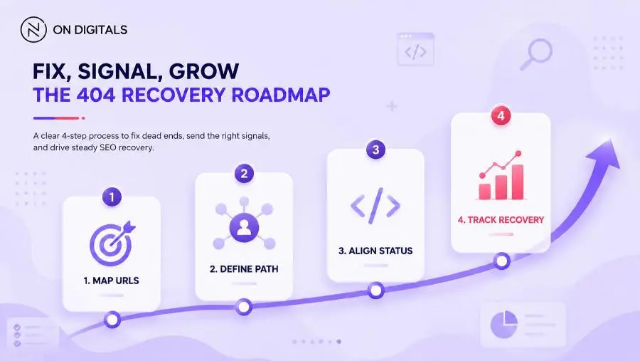
How to design a better 404 page
A 404 page update works best when each owner has a clear role. Design owns the page experience. Development owns the HTTP response. SEO owns the broken-URL review queue. Content supports the message and tone.
Use this workflow before updating the template:
- Map affected URLs by priority
Start with URLs that receive traffic, backlinks, leads, internal links etc. A broken service page deserves faster review than an old archive URL. - Define the recovery path
Match the next step to the visitor’s likely intent. Product pages may need category recovery, while blog pages may need search. - Confirm the status code
Ask the developer to test the actual response header. The visual page and HTTP signal should match. - Write short recovery copy
Explain the issue clearly. Then give the user a practical path forward. - Design for mobile first
Keep the main action visible early. Avoid hiding search or key buttons under large visuals. - Track what happens next
Review 404 visits, recovery clicks, search usage etc. The data helps teams find broken paths that deserve fixing.
 Treat 404 recovery as a cross-functional workflow. SEO maps the broken URLs and confirms the server response, Design handles the UX template, and Marketing tracks the post-launch recovery clicks.
Common 404 page mistakes
Many 404 pages look polished while the recovery path stays weak. Before publishing, review the template through UX, SEO, and business impact.
| Mistake | Why it hurts | Better approach |
| Returning 200 for a missing page | Creates soft 404 risk | Return 404 or 410 |
| Sending every missing URL to homepage | Breaks intent match | Redirect only when the target is relevant |
| Using vague copy | Leaves visitors unsure | Explain the missing page clearly |
| Hiding navigation | Blocks recovery | Keep key paths visible |
| Adding heavy animation | Slows the error experience | Use lightweight visuals |
| Skipping analytics | Repeated issues stay hidden | Track 404 visits and actions |
| Ignoring mobile layout | Main action may drop too low | Test real screen widths |
These checks matter most after migrations, redesigns, product cleanup, or CMS restructuring. When many URLs change at once, the 404 template becomes part of release QA.
How to test a 404 page before release
A 404 page should be tested like any other website template. The design team can review layout, while the developer confirms server behavior. SEO should validate crawl signals before the change goes live.
Recommended release checks:
- Open a fake URL and confirm the custom 404 template appears.
- Check the response header for 404 or 410.
- Test search, homepage, support path etc.
- Review mobile layout on common screen widths.
- Run a crawl to find internal links pointing to missing URLs.
- Check analytics events for 404 visits and recovery clicks.
- Review Search Console after migration or major URL changes.
When Search Console keeps reporting missing URLs after a release, use a separate 404 error fix process in Google Search Console to decide which URLs should be restored, redirected, or left as true 404 pages.
This test protects both the visitor and the business. If a high-value path breaks, the team can decide whether to restore the page, redirect it, or keep it as a true 404.
FAQ about 404 page examples
Are 404 pages bad for SEO?
404 pages are normal when content is removed or a visitor enters the wrong URL. SEO issues appear when important pages break, internal links point to missing URLs, or the server returns the wrong status. High-value 404 URLs should be reviewed by traffic, backlinks, replacement intent etc.
What is a soft 404?
A soft 404 happens when a missing page returns a 200 response instead of a 404 or 410. Google discourages this because it can confuse users and search engines. The fix depends on the URL: restore real content, redirect to a closer page, or return the correct error status.
Should every 404 page be redirected?
Redirect a 404 URL when a close replacement exists. A deleted service page may need a redirect to the updated service URL, while an expired page with no useful match can return 404 or 410. Relevance matters more than forcing every visitor to the homepage.
What should a good 404 page include?
A good 404 page should include a clear message and a recovery route. Search works well for large websites, while category links suit ecommerce. Service businesses can guide visitors to active solution pages, contact routes, case studies etc.
How do you make a 404 page mobile-friendly?
Keep the message short, place the main button high on the screen, and avoid heavy effects that delay loading. Tap targets should be easy to press. If the page includes search, the input field should remain visible without forcing the visitor to scroll too far.
Conclusion
The best 404 page examples treat broken URLs as recovery moments. Creative design can make the page memorable, while clear copy and the correct status code protect the user path. For SEO teams, the real value appears when the 404 template connects with page priority, redirect decisions, crawl checks, and analytics.
If your website has important URLs returning 404s after a migration, redesign, or CMS cleanup, On Digitals can help review the affected templates and define the right recovery path before broken traffic turns into lost business opportunities.

NEWEST POSTS
- Advertising Industry In Vietnam: The 2026 Trends, Channels and Market-Entry Strategy
- Best SEO Company in Vietnam: Latest Shortlist For Businesses
- How To Leverage Social Media For Customer Service Like A Pro?
- Social Media Post Tips – 8 Ways To Boost Engagement
- How To Use Social Media for Sales – In-depth Beginner Guide
Read more