
Insights
How Brand Color Theory Redefines Emotion and Identity in 2025
On Digitals
14/11/2025
14
Brand color theory is redefining how brands grow in 2025. With the rise of short-form content, AI-assisted design, and deep personalization, using colors strategically has become more critical than ever.
But why should businesses care about color theory? Is choosing a bold red enough to stand out? In this article, On Digitals explores the foundational principles of color and how to effectively apply them in branding.
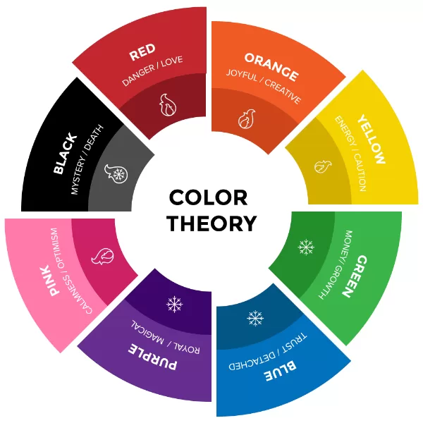
What is color theory?
Brand color theory is the foundation that guides designers in choosing and combining colors effectively to enhance marketing and branding strategies. It helps identify color combinations that are visually harmonious and emotionally aligned with the brand’s message, ensuring every hue contributes to a cohesive and recognizable identity.
What color theory brand do you need to know?
Basic color theory
Color isn’t just a visual element, it’s emotional and psychological. We respond to each color differently based on our personal experiences, cultural background, and environment. This blend of psychology and aesthetics forms the foundation of brand color theory, helping designers craft visuals that communicate emotion and strengthen brand identity.
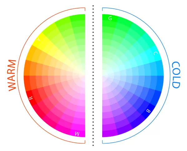
The color theory wheel, introduced by Isaac Newton in 1666, organizes colors into three main groups:
- Primary colors: Red, Blue, Yellow
- Secondary colors: Mixtures of primary hues such as Green, Orange, and Purple
- Tertiary colors: Combinations of primary and secondary tones like Blue-Green or Red-Purple
When divided, the wheel also highlights:
- Warm colors (Red, Orange, Yellow): Energetic, vibrant, and attention-grabbing
- Cool colors (Blue, Green, Purple): Calm, peaceful, and trustworthy
Understanding warm and cool tones is a key part of brand color theory, helping brands select the right palette that aligns with their core message and emotional goals.
Color Properties
Color properties refer to the four key attributes hue, tint, shade, and tone that define how a color appears and feels. These are essential tools for designers working on brand color theory:
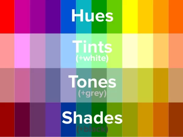
What are the properties of color?
- Hue: The base color, the foundation of every palette.
- Tint: A lighter version of the hue created by adding white; conveys freshness and approachability.
- Shade: A darker hue created by adding black; evokes depth, power, and luxury.
- Tone: A neutralized hue (adding gray); gives a calm, professional, and sophisticated feel, perfect for minimalist branding.
Understanding these properties allows brands to control how their colors evoke emotion, contrast, and personality in every visual asset.
Color Scheme
By using the color theory wheel, designers can develop cohesive color schemes for marketing and branding materials. Choosing the right color combinations enhances user experience and strengthens brand identity across all platforms.
Here are the most common color schemes used in branding:
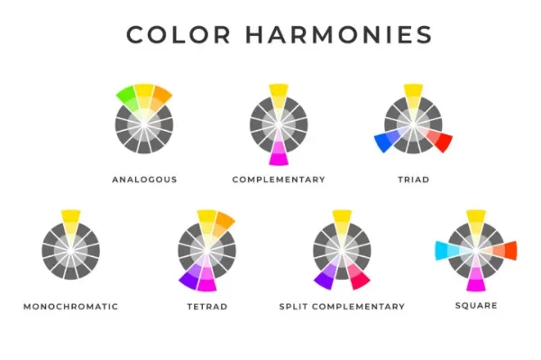
Color theory wheel in brand color theory
- Monochromatic: One hue with varying tints and shades for a unified, elegant look.
- Analogous: Three adjacent colors on the wheel, ideal for natural harmony and visual flow.
- Complementary: Two opposite colors on the wheel for bold contrast and energy.
- Square: Four evenly spaced colors that create dynamic and balanced compositions.
Other variations like Triadic or Tetradic schemes,… are also popular for creating diversity while maintaining visual harmony.
Remember — your chosen color palette should reflect both your design purpose and your brand personality. The best use of brand color theory is not just about aesthetics, but about crafting emotional impact and recognition that last.
How to Use Color Theory Effectively in Branding
In any branding process, the main goal of applying color theory is to enhance accessibility and brand recognition. A well-designed color palette not only looks appealing but also ensures consistency and readability across all media platforms.
Contrast: Make Key Elements Stand Out
Contrast helps direct the viewer’s attention to the most important parts of your design such as logos, CTAs, or text. A high contrast between foreground and background boosts readability, especially on mobile screens.
The contrast between foreground and background
Using too little contrast can make your visuals flat, while too much may feel harsh, so balance is key.
Vibrancy: Control Energy and Emotion
Vibrancy determines how intense and lively your colors appear. Bright, saturated tones bring energy and excitement, making them perfect for youth-oriented or entertainment brands.
Softer, muted colors create a sense of sophistication and calm, ideal for luxury, wellness, or professional services.
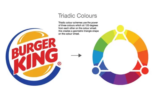
Harmony: Keep Visual Balance and Flow
Harmony ensures that all colors in your palette complement one another. It’s achieved by applying color schemes (analogous, complementary, triadic, etc.) from the color theory wheel to create balance between contrast and unity.
Triadic color harmony for a cohesive brand look.
A harmonious palette helps users feel visually comfortable and builds brand trust through consistency.
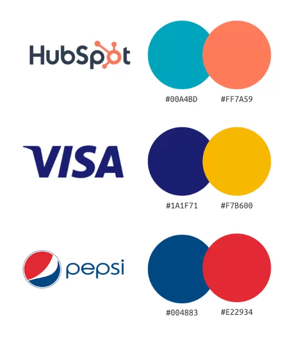
Consistency: Strengthen Brand Recognition
Consistency is the foundation of brand memorability. Using the same color combinations across digital ads, packaging, and social media helps customers immediately recognize your brand.
 Color consistency strengthens brand memorability
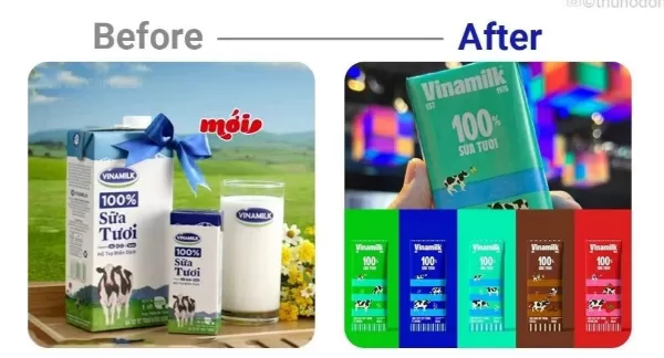
Brands like Grab’s green or Tiffany’s blue prove how color consistency can become a mental trigger, linking emotion with identity.
Pro Tips for Applying Brand Color Theory
While understanding the principles of contrast, vibrancy, harmony, and consistency builds a strong foundation, true mastery lies in how you apply these concepts in real projects.
The following expert tips will help you translate theory into practice ensuring that your color choices not only look beautiful but also drive brand recognition and emotional engagement.
- Follow the 60–30–10 rule: Use 60% dominant, 30% secondary, and 10% accent colors for visual balance.
- Test for accessibility: Use tools like Adobe Color Wheel or Color Contrast Checker to maintain clarity across backgrounds.
- Check color performance on all media: Preview your palette in both digital and print formats to ensure consistency.
- Design for light and dark modes: Adjust contrast and brightness to maintain visibility across devices.
- Reflect your brand personality: Every hue should support your brand story, not just decorate it.
Color Theory Trends with AI in 2025
In 2025, according to research by Adobe, consumers are looking forward to two distinct yet simultaneously trending color styles: Earthen Tones and AI-Generated Colors with Sci-Fi Inspired Shades. This divergence reflects a need to balance authenticity, natural connection, and technological innovation in modern life.
The Rise of Earthen Tones
This trend emphasizes authenticity, sustainability, and comfort by utilizing colors directly inspired by nature and minerals. Includes warm browns, rusty hues, moss greens, olive tones, and terracotta. They typically feature low-to-medium saturation, creating a sense of calmness, trustworthiness, and organic quality.
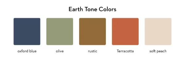
Natural earth colors bring warmth and grounded emotion
Branding Application: Brands focusing on wellness, healthcare, sustainable fashion, or artisanal products will leverage these tones to convey messages of stability, high quality, and environmental responsibility. This is a conscious reaction to the information overload of the digital world.
The Breakthrough of Sci-Fi and AI-Generated Colors
This trend showcases pioneering spirit, technology, and innovation, often powered by AI algorithms. These colors include bright, vibrant, and unconventional tones, such as neon purple, electric blue, illusory fuchsia pink, or complex gradients. They are often created or refined by AI to achieve unique visual harmony, often stepping outside traditional color rules.
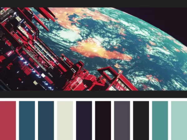
Sci-fi palettes showcase innovation through bold AI tonetones
Branding Application: Suitable for sectors like Technology (Tech), gaming, Web3, and brands seeking to position themselves as innovative, dynamic, and future-forward. These shades make a strong impact, demonstrating an ability to transcend conventional visual boundaries.
Deep Personalization through AI in Color Palettes
Beyond the stylistic division, the role of AI is fundamentally changing how we experience color online. Three out of ten consumers desire to experience websites with vibrant, highly adaptable color palettes that adjust to suit the user’s mood, preferences, or even the time of day.

Personalized color palettes evolve with AI intelligence
- Mechanism: AI analyzes user data (browsing history, geo-location, screen light) to automatically alter the saturation, tone, or even the entire color scheme of a digital interface.
Branding Effectiveness: This level of personalization helps brands forge a deeper emotional connection. If a color palette can shift to make a user feel relaxed (cool colors) or encouraged to purchase (warm colors) at the optimal moment, the brand experience is significantly maximized.
Many experts predict that in the near future, major brands will no longer rely on a single static color palette but will adopt AI-driven dynamic color palettes across all their branding efforts, from UI/UX design to personalized marketing campaigns. This marks a shift from applying static color to viewing color as an interactive experience.
FAQs about brand color theory
How does color theory psychology influence brand trust?
Color theory psychology helps explain why certain colors create feelings of reliability, excitement, or calmness. Brands that choose colors aligning with their values can build stronger trust and emotional loyalty among their audiences.
Can color theory be applied differently across digital and physical branding?
In digital design, contrast and accessibility play a bigger role, ensuring readability across devices. In physical branding, lighting, texture, and material affect how colors appear requiring slight adjustments from the digital palette.
How often should brands update their color palette?
A complete color overhaul isn’t always necessary. Instead, brands can refresh their palette every few years to align with design trends or new business directions while keeping their core brand color theory consistent for recognition.
What mistakes should businesses avoid when applying color theory?
Common mistakes include using too many colors, ignoring contrast ratios, or choosing shades that clash with brand personality. Overusing trendy colors can also make the design feel outdated quickly.
How can small businesses use color theory effectively without hiring a designer?
Start by studying the color theory wheel to understand harmony and contrast. Use free tools like Adobe Color or Coolors to test palettes, and focus on consistency, using the same hues across social media, packaging, and website design.
Brand Color Theory and the Future of Branding
Mastering brand color theory is not just an aesthetic choice but a crucial business strategy. This article has clarified how elements like contrast, saturation, and color psychology shape customer emotions, thereby helping brands build a consistent and memorable identity in the age of short-form content and AI-assisted design.
Brand color theory maps colors to brand meaning
At On Digitals, we understand that the future of branding lies in adaptability. Combining the foundational principles of color with the latest AI trends will enable your business to create vibrant, deeply personalized palettes, ultimately driving brand growth effectively and distinctly in 2025.
May you also like:
Read more