Insights
Logo Design Psychology: How Do Colors Influence Brand Impressions in 2025?
On Digitals
14/11/2025
40
Logo design psychology has become more central than ever in the digital-first era and the rise of AI-driven branding. A logo is no longer just a visual symbol — it has evolved into a fast, emotional language that instantly shapes how customers perceive and connect with a brand. It’s the first and most powerful cue in establishing brand identity in the consumer’s mind.
In this article, On Digitals explores how color, the core element of color psychology for logo design, influences trust, emotion, and purchasing behavior. By understanding the psychological meanings behind colors, brands can create deeper, more enduring emotional connections with their audiences in 2025 and beyond.

How color shapes emotion in logo design psychology
Why Logo Design Psychology Matters
In today’s competitive digital landscape, a logo has surpassed its traditional role as a simple visual identifier, it is now the first psychological bridge between a brand and its audience. Logo design psychology isn’t an optional creative approach; it’s a strategic necessity.
By understanding how colors affect human psychology, brands gain precise control over how they are perceived. A logo designed on psychological principles can instantly evoke the desired emotional response, from trust and excitement to comfort and inspiration.
Logo Design Color Psychology Explained
Plays a crucial role in defining a brand’s personality and emotional impact, colors serving as one of the most powerful tools in modern logo design psychology. Each business has its own story and values, and selecting the right palette helps express those emotions while resonating with the target audience.
How The Color Works
Colors have the power to influence perception and emotion. Understanding color psychology in logo design helps you select shades that reflect your brand’s character and ensure customers can instantly recognize and associate those colors with you.
How iconic brands use color to stand out
By tapping into this emotional connection, you can position your brand identity effectively at first glance. In essence, logo design psychology shows that thoughtful use of color not only enhances visual appeal but also ensures your logo communicates the right message, strengthening both recognition and emotional resonance with your audience.
How Colors Affect Emotions and Brand Perception
The phenomenon of color psychology for logo design plays a crucial role in shaping consumer emotions and behavior. Color selection influences not only brand recognition but also how customers perceive, remember, and interact with a business. In logo design psychology, every hue carries its own psychological meaning, affecting brand perception and the effectiveness of digital communication.
Below are the key ways color psychology directly impacts brand strategy and digital marketing campaigns, helping your logo stand out while emotionally connecting with your brand’s core values:
Culture and Context:
The meanings we attach to different hues are shaped by culture, history, and environment rather than appearance alone. Through the lens of logo design psychology, each shade conveys a unique emotional tone that influences how people interpret and connect with a brand.

Red speaks differently around the world
For example, in many Asian cultures, red symbolizes luck, prosperity, and happiness. In contrast, across Europe, red is often associated with blood, fire, and danger. This is why red frequently appears on warning or prohibition signs. With its long wavelength and strong visual impact, it’s the ideal color to signal urgency or draw immediate attention to action.
Recognition and Recall:
Choosing the right color from the very beginning of your branding journey is a key aspect of logo design psychology, as it strengthens recognition and memorability. When consumers consistently see a specific color linked to a brand, they form a natural mental association, identifying the brand effortlessly across different contexts.

When a color becomes a brand’s signature
A perfect example is the iconic green of Grab. The sight of green-uniformed drivers has become instantly recognizable, making people think of the brand immediately. Even though Gojek uses a similar shade, most consumers still associate green with Grab, a clear demonstration of how color can define a brand’s identity and psychological footprint in logo design psychology.
Audience Alignment:
Crafting an effective color palette begins with understanding your audience, their age, lifestyle, and emotional cues. Guided by the principles of logo design psychology, each hue serves as more than a visual element; it becomes an emotional tool that expresses personality and communicates a brand’s message with clarity.

Red tones that feed both eyes and emotions
Fast-food brands often target younger audiences with red and yellow tones, colors that evoke warmth, joy, and appetite. The contrast between red and golden hues also enhances food appeal, making these shades a proven strategy in F&B branding.
After exploring how each hue shapes perception, it’s essential to recognize that colors carry distinct meanings that speak directly to emotion. These associations form the foundation of logo design psychology, shaping how audiences emotionally connect with a brand. The next section explores what different shades communicate and how they can strengthen your brand’s visual message.
Color Psychology in Logo Design: What Different Colors Communicate
Selecting brand colors is more than a visual choice, it’s a strategic decision that shapes how customers perceive and connect with your business. Rooted in logo design psychology, color choices evoke emotions that words alone can’t capture, defining how your brand communicates and feels to its audience.
Below is an analysis of the most powerful colors in logo design, their psychological meanings, and the industries where they’re most effective:
Blue in Logo Design Psychology
Blue represents trust, safety, and logic, making it one of the most popular colors for corporate logos. It evokes calmness, reliability, and professionalism, helping brands build credibility and long-term relationships with customers.
Why brands choose blue to build credibility
Industries that commonly use blue include:
- Banking & Finance: Stability and transparency.
- Technology: Modernity and reliability.
- Healthcare: Calmness and professionalism.
However, insights from logo design psychology reveal that while blue conveys trust and calmness, its popularity can make it difficult for brands to stand out. The color’s cool undertones may also soften emotional warmth, making it less effective for industries like food, fashion, or entertainment, where energy and human connection are essential.
Red in Logo Design Psychology
Red captures attention instantly, it symbolizes passion, energy, and excitement. This high-energy color triggers urgency and strong emotion, which is why it’s favored by brands that emphasize speed, creativity, or boldness.
Bold red logos that capture instant attention
Industries where red thrives:
- Food & Beverage: Stimulates appetite and emotion (e.g., Coca-Cola, KFC).
- Sports & Automotive: Represents energy, power, and action.
- Media & Entertainment: Evokes enthusiasm and dynamism.
Excessive red can feel overwhelming or aggressive. This understanding comes from logo design psychology, which highlights how certain tones can influence emotional response. In trust-driven industries like finance, healthcare, or education, muted reds or blends with neutrals are often preferred to maintain both warmth and professionalism.
Black, Grey and Silver in Logo Design Psychology
These tones convey luxury, strength, and professionalism. They give logos a refined and timeless look, often chosen by brands that value authority and minimalism.
Luxury meets power in monochrome design
Industries where these colors are prevalent:
- Luxury fashion: Symbolizing elegance and sophistication.
- Technology & Automotive: Representing precision and innovation.
- Finance & Consulting: Reflecting stability and trustworthiness.
Too many dark tones can strip away a brand’s sense of warmth and approachability. When balanced thoughtfully, however, black, grey, or silver paired with lighter hues can maintain sophistication without feeling distant. This balance lies at the heart of logo design psychology, where contrast and tone work together to preserve both elegance and emotional connection in visual identity.
Yellow and Gold in Logo Design Psychology
Yellow and gold express warmth, optimism, and creativity. They instantly uplift mood and symbolize friendliness and positivity, ideal for brands that want to feel energetic and approachable.
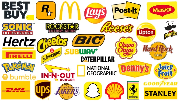
Warm tones that energize and connect
Common industries using yellow or gold include:
- Food & Beverage: Conveying freshness and joy.
- Retail & Customer Service: Representing friendliness and reliability.
- Creative & Media: Inspiring innovation and enthusiasm.
Bright yellow can sometimes feel too playful for luxury branding, yet gold captures the same optimism while adding sophistication and prestige. In the context of logo design psychology, this shift from brightness to depth reflects how subtle changes in tone can transform a brand’s perceived value and emotional impact.
Understanding how each color shapes perception is essential to building a logo that truly reflects your brand’s essence. When applied strategically, color psychology for logo design allows brands to balance emotion and recognition, ensuring every shade reinforces trust, energy, or sophistication in line with their identity.
FAQs: How Do Colors Influence Brand Impressions in 2025?
How can color psychology influence brand trust and loyalty over time?
Colors play a long-term role in building emotional consistency. When customers repeatedly associate a color with positive experiences, it strengthens brand trust and loyalty, turning visual memory into emotional attachment.
Does logo color psychology work the same in digital and physical branding?
Not exactly, digital environments rely on light and contrast, while printed branding depends on material texture and ink saturation. Understanding these differences ensures color psychology remains effective across all brand touchpoints.
Can rebranding with new logo colors change customer perception?
Changing your logo color can reset how audiences emotionally perceive your brand. A shift from blue to red, for example, might transform your identity from calm and reliable to bold and energetic, depending on your brand’s new direction.
How does background color affect logo design psychology?
The background color plays a crucial role in contrast and visibility. A well-chosen background enhances legibility and reinforces the emotional tone of the logo’s main palette.
How do AI and personalization affect logo color choices in 2025?
With AI-driven branding, companies can now analyze audience emotion data to tailor logo color palettes for specific demographics, making color psychology more data-backed, personalized, and predictive than ever before.
The future of color psychology is intelligent
How On Digitals Helps
Logo design psychology is the strategic cornerstone of building brand identity. Selecting colors must be grounded in their psychological meanings and the brand’s emotional goals, ensuring the logo is not only visually appealing but also forges a powerful emotional connection with customers.
At On Digitals, we recognize that a logo is the soul of a brand. By deeply applying these principles of color psychology, our team ensures every symbol we design accurately reflects the core values of your business, helping your brand stand out and make a lasting, memorable impression in a competitive market.
NEWEST POSTS
- How to find website broken links for better SEO and user experience
- Brand Identity Design Explained: Strategy And Real Examples
- Video Campaign Google Ads: A Practical Guide to Strategy, Formats, and Optimization
- Small Business Branding – 4 Strategies To Boost Your Brand!
- A Complete Guide to Crafting a Powerful Personal Branding Statement That Stands Out
Read more
