
Insights
Fonts for Logos: Top 9 Affordable Fonts for Designer
On Digitals
17/11/2025
31
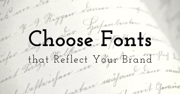
In today’s digital world, where recognition speed is key, the choice of fonts for logos plays a more crucial role than ever before. A meticulously selected typeface has the power to convey the brand’s personality.
Especially for designers and startups operating on tight budgets, finding some fonts is a valuable consideration for cost optimization. In this article, On Digitals has compiled 10 free, designer-favorite fonts to elevate your brand.
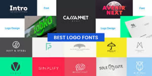
Top Best Fonts To Use In Logos
Font #1: Montserrat
Montserrat is an excellent choice if clarity and readability are your top priorities. Inspired by classic signage and old posters, this typeface boasts a clean, modern geometric style, similar to Gotham or Futura. It is a royalty-free font with a diverse family range, optimizing it for any design purpose.
Despite its high versatility, Montserrat’s major drawback is its widespread popularity. This common use can make your chosen fonts for logos appear “generic” and lack the unique distinction necessary to stand out against competitors in the market.
-
- Font Classification: Geometric Sans-Serif
- Origin: 2011
- Designer:Julieta Ulnavosky
- SImilar fonts: Gotham, Futura
- Best For: Tech & SaaS, Creative Agencies, Digital Media, Ecommerce, Retail, Education,…
- Price: Free
How It Works In Logo
A showcase of Montserrat’s clean logo performance.
Brands that choose this font are typically positioned as Professional and Modern Premium, prioritizing clarity, readability, and cost-efficiency.
Font #2: Space Mono
Space Mono is a unique choice among fonts for logos, especially if your brand leans towards a digital and futuristic style. With its crisp Monospace design and distinct geometric details, this font conveys a technical, unique, and retro-futuristic feel. This royalty-free font excels when you need to create a logo with strong personality and differentiation.
However, due to its Monospace nature, Space Mono is not the ideal font for long body text, and should strictly be used for the main logo title or short taglines. Its distinctiveness is highly attractive, but it requires the brand to have a clear positioning to avoid feeling too “niche” or unprofessional.
- Font Classification: Monospaced Sans Serif
- Origin: 2016
- Designer: Colophon Foundry
- SImilar fonts: Anonymous Pro, Inconsolata, Courier New
- Best For: Game, AI, Tech, Fashion Streetwear,…
- Price: Free
How It Works In Logo
Space Mono adds a bold, futuristic edge to logo design.
Font #3: Lato
When selecting fonts for logos, Lato offers designers an incredibly secure and welcoming option. Crafted by Łukasz Dziedzic, this Humanist Sans-Serif balances structural clarity with a noticeable touch of warmth. Its design makes the brand feel highly approachable, yet undeniably professional. Being royalty-free, Lato provides a massive font family, from thin to bold ensuring optimal performance and legibility across all marketing materials.
However, a trade-off for its superior versatility is its sheer ubiquity. While Lato is a powerhouse for web design, its frequent use might dilute the distinctiveness of your chosen fonts for logos, potentially making your visual identity less memorable than custom or less common alternatives.
- Font Classification: Humanist Sans-Serif
- Origin: 2010
- Designer: Łukasz Dziedzic
- Similar Fonts: Open Sans, Source Sans Pro, Nunito
- Best For: Startups, Fintech, Healthcare, Education, NGOs, Corporate brands
- Price: Free
How It Works In Logo
How Lato enhances approachable, clean logo identity
Brands opting for Lato often gravitate towards a friendly, trustworthy and professional aesthetic, making it an ideal choice for sectors prioritizing transparency and human connection. Due to its sharp clarity and superior scalability, Lato is highly effective as the best font to use in logo wordmarks or in taglines accompanying the brand’s symbol a hallmark of best font used in logo design
Font #4: Poppins
With its balanced design consistent letter proportions and clear strong weights Poppins achieves harmony between creativity and precision, a quality especially suited for young brands, startups and technology firms.
Launched in 2014 Poppins is often viewed as the friendlier version of Futura but with superior scalability for digital branding. Offering optimal display across both print and web platforms this is an affordable fonts for logos choice that enables businesses to save costs while still guaranteeing high aesthetic standards a prime example of the best fonts to use in logos today
- Font Classification: Geometric Sans-Serif
- Origin: 2014
- Designer: Indian Type Foundry
- Similar Fonts: Avenir, Futura, Circular Std
- Best For: Tech Startups, SaaS, Digital Agencies, Creative Studios, E-commerce
- Price: Free
How It Works In Logo
Poppins enhances logo designs with clean, bold clarity
Brands that choose Poppins often aim for a youthful, modern, and energetic image. When used in wordmark logos or paired with a supporting serif typeface, Poppins strikes the perfect balance between creativity and professionalism.
This makes it one of the most recommended fonts for logos, especially for designers seeking an affordable yet high-impact option.
Font #5: Didot
Didot, originating in the late 18th century, carries a refined “Parisian chic” aesthetic that makes it a favorite among luxury fashion, beauty, and editorial brands. While it is a classic serif typeface, modern digital versions such as Linotype Didot and HTF Disui ensure strong performance in contemporary logo design projects with moderate budgets.
However, its high contrast makes it less suitable for small sizes or overly complex marks. When used correctly in wordmarks, titles, or monograms, Didot delivers timeless elegance, solidifying its status as one of the most sophisticated fonts for logos.
- Font Classification: Modern Serif
- Origin: Late 18th century (Digital Revivals: 1991–2000s)
- Designer: Firmin Didot (revived by Adrian Frutiger & Linotype)
- Similar Fonts: Bodoni, Playfair Display, Modern No. 20
- Best For: Fashion, Beauty, Jewelry, Luxury Goods, Editorial Brands
- Price: $25.00 USD
How It Works In Logo
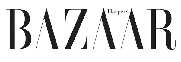
A classic serif like Didot elevates luxury logo style.
Font #6: Futura
Futura is not a free typeface, yet it remains one of the most affordable fonts for logos worth investing in. Its perfect balance between aesthetics and functionality makes it a timeless choice for brands seeking both visual elegance and professional precision. When used strategically, Futura delivers a sense of confidence, refinement, and visual authority that strengthens any brand identity.
Characterized by its clean geometric construction, Futura embodies clarity and modernism. However, this precision can sometimes make it feel slightly cold or impersonal if not paired with complementary color tones or supporting typography. Designers often combine Futura with softer or more humanist fonts to achieve emotional balance while retaining its sleek appeal.
-
- Font Classification: Geometric Sans-Serif
- Origin: 1927
- Designer: Paul Renner
- Similar Fonts: Avenir, Gotham, Montserrat, Century Gothic
- Best For: Technology, Automotive, Architecture, Luxury Retail, Fashion, Corporate Brands
- Cost: $29.00
How It Works In Logo
Geometric clarity meets branding power with Futura
Brands that choose Futura often aim to present a professional, forward-thinking, and iconic image. Its bold geometry makes it especially effective in wordmark or typographic logos, where each line and proportion reinforces a sense of precision and long-term vision.
Thanks to its enduring design legacy, Futura consistently ranks among the best fonts to use in logos and remains a preferred choice for companies that value stability, innovation, and class.
Font #7: Avenir
As one of the most affordable high-end fonts for logos currently available, Avenir offers numerous weights Light Book Medium Heavy Black allowing great flexibility in design from the best font to use in logo headings to digital interfaces. However due to its high popularity you should pair Avenir with unique colors, generous spacing or a distinctive tagline to forge a unique identity.
This font particularly shines in conveying humanism within modernity not being as rigid as Futura while still maintaining structure and minimalism. That’s why Avenir is considered one of the best fonts to use in logos adopted by major brands like Apple Maps Toyota Airbnb and many creative agencies for their core brand recognition, a testament to the best font used in logo design.
- Font Classification: Humanist Sans-Serif
- Origin: 1988
- Designer: Adrian Frutiger
- Similar Fonts: Proxima Nova, Helvetica Neue, Nunito Sans
- Best For: Tech & Startups, Corporate Brands, Finance, Education, UX/UI, Creative Agencies
- Price: $42.99
How It Works In Logo
Thanks to its well-balanced character proportions and excellent rendering across all platforms, Avenir becomes the best font to use in logo design for brands aiming for a professional yet friendly look. When paired with a complementary serif font or subtle color palettes, Avenir helps the logo feel modern yet approachable, perfectly capturing the ‘human-centered design’ ethos of the digital age
Font #8: Bodoni
Bodoni stands out as one of the most elegant and timeless fonts for logos, offering a perfect blend of sophistication and contrast. Known for its dramatic thick-and-thin strokes, high contrast, and geometric precision, Bodoni brings a sense of luxury and refinement to any design. It’s often considered one of the best fonts to use in logos for premium brands, particularly in fashion, beauty, publishing, and fine dining industries.
While Bodoni exudes prestige, it requires careful use when scaled down, its thin lines can lose legibility. Designers often pair Bodoni with a simple sans-serif font to maintain balance and readability, ensuring the logo remains both stylish and functional across all formats.
- Font Classification: Humanist Sans-Serif
- Origin: 1988
- Designer: Adrian Frutiger
- Similar Fonts: Proxima Nova, Helvetica Neue, Nunito Sans
- Best For: Tech & Startups, Corporate Brands, Finance, Education, UX/UI, Creative Agencies
- Price: $25.00
How It Works In Logo
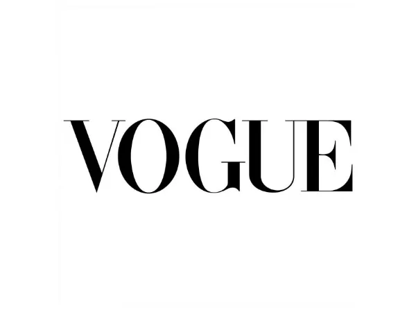
Vogue’s classic look showcases Bodoni’s luxury appeal.
Brands that choose Bodoni aim to express elegance, tradition, and artistic craftsmanship. Its refined structure makes it the best font used in logo design for labels that value heritage and class while still appearing contemporary. With its striking contrasts and timeless charm, Bodoni remains one of the best fonts to use in logo projects where sophistication and visual impact are key.
Font #9: Helvetica
It is impossible to discuss fonts for logos without mentioning Helvetica, the ultimate symbol of minimalism, modernity, and universality in design. Created in 1957 by Max Miedinger and Eduard Hoffmann, Helvetica quickly became the top choice for global brands thanks to its clear readability and timeless visual balance.
Often called the “universal typeface,” Helvetica is neutral yet powerful. Whether you are designing a logo for a technology company, a fashion brand, or a nonprofit organization, Helvetica conveys professionalism, transparency, and modern sophistication without the need for decorative elements. This versatility explains why brands such as BMW, Lufthansa, Panasonic, Target, and Nestlé rely on Helvetica as the foundation of their brand identity.
- Font Classification: Neo-Grotesque Sans-Serif
- Origin: 1957
- Designer: Max Miedinger, Eduard Hoffmann
- Similar Fonts: Arial, Univers, Neue Haas Grotesk
- Best For: Tech Companies, Corporates, Startups, Healthcare, Transportation, Retail
- Price: $39.00
How It Works In Logo
Helvetica shows how pure minimalism elevates luxury logos.
Brands that use Helvetica aim to project neutrality, credibility, and a sense of global professionalism. It is ideal for minimalist logo designs where the message is delivered clearly and entirely focused on the brand itself. With its perfect balance of form and function, Helvetica consistently ranks among the best fonts to use in logos for businesses that seek a modern, enduring, and highly recognizable identity across all platforms.
Brand Typefaces You Should Know
As of today, there are four core typeface families that continue to play a vital role in modern fonts for logos. Understanding the personality and design characteristics of each will help you choose the best font used in logo design to represent your brand’s identity effectively. Below is a concise breakdown of these four essential font types:
- Sans Serif Fonts: Modern and clean, these fonts have no decorative strokes (serifs) at the end of each letter. They convey simplicity, clarity, and professionalism, making them the best fonts to use in logos for tech companies, startups, and digital brands.
- Serif Fonts: Classic and elegant, serif fonts carry decorative strokes that evoke a sense of trust, heritage, and sophistication. They are ideal for financial institutions, law firms, and luxury fashion brands looking to establish authority and timeless appeal.
Typeface categories that shape logo font selection.
- Script Fonts: Inspired by handwriting and calligraphy, script fonts convey personality, elegance, and romance. They are perfect for brands in cosmetics, handmade goods, or premium services that want to express craftsmanship and intimacy.
- Display Fonts: Designed for high visual impact at large sizes, display fonts feature artistic, decorative, and unconventional styles. These fonts are ideal for entertainment, gaming, or creative industries where boldness and originality are key.
Mastering these font categories is just the beginning. To find the best font to use in logo creation, you’ll also need to apply a clear set of design principles and selection criteria.
How to Choose A Font For Your Brand
Selecting fonts for logos isn’t merely about personal taste, it’s a strategic decision that directly affects how customers perceive your brand. Below are the key factors that can guide you toward the perfect choice:
- Define Your Brand Personality: Ask yourself: Is your brand modern, traditional, playful, serious, luxurious, or friendly? Your chosen font should mirror that personality
- Prioritize Readability and Legibility: Your logo must remain easy to read at all sizes, from large billboards to small app icons. Avoid overly thin, decorative, or complex script fonts that reduce clarity when scaled down.
- Focus on Scalability and Versatility: A strong logo font should look great across all media like: digital, print, and social platforms. Ensure the font maintains quality whether enlarged or minimized, keeping visual balance intact.
- Avoid Overused Fonts: Steer clear of overly common typefaces like Comic Sans or generic Helvetica/Montserrat clones if you want a unique, memorable logo. Your goal is differentiation, not blending in.
- Check Commercial Licensing: Before finalizing a font, always confirm whether it’s free for commercial use or requires a paid license. This helps avoid legal issues later on.
- Experiment with Font Pairing: When using a tagline or supporting text, make sure your main logo font pairs harmoniously with the secondary font. Balanced typography enhances brand cohesion.
- Choose a Font Family with Multiple Weight-font: Opt for fonts that include various weights (Light, Regular, Bold, etc.). This ensures consistency and flexibility throughout your entire brand identity system.
Essential criteria for selecting effective logo fonts
Selecting the right fonts for logos is both an art and a strategy. The insights above from understanding the four major typefaces to applying practical design principles, will help you identify the best fonts to use in logos that not only enhance readability but also strengthen brand recognition and emotional connection.
FAQs: Fonts for Logos: Top 10 Affordable Fonts for Designer
What font style makes a logo look more premium?
Luxury and high-end brands often use serif fonts like Didot or Bodoni because their fine contrasts and elegant curves convey sophistication and exclusivity. These are among the best fonts to use in logos when you want to communicate heritage, quality, and craftsmanship.
Are paid fonts always better than free ones for logos?
Not necessarily. Many affordable or even free fonts for logos such as Montserrat or Poppins deliver professional quality and broad versatility. The difference usually lies in licensing rights, uniqueness, and the range of available font weights for branding consistency.
Should startups invest in a custom font for their logo?
For most startups, using the best font used in logo design from trusted font libraries is more cost-effective than commissioning a custom typeface. A strong typographic foundation paired with unique color, spacing, or iconography can still make your brand identity stand out.
How many fonts should be used in a logo design?
Ideally, just one. Using too many fonts reduces visual consistency and weakens brand recall. If a tagline or submark is needed, designers may combine the best font to use in the logo with a complementary secondary typeface for balance, but never more than two fonts total.
Limit your logo design font for clarity and impact.
What’s the most common mistake when choosing fonts for logos?
The biggest mistake is prioritizing aesthetics over brand fit. A font might look stylish but fail to express your company’s tone or values. Always test your fonts for logos across different platforms and sizes to ensure readability, scalability, and alignment with your target audience.
The Power of Typography in Logo Design
In this article, we explored the 9 best fonts for logos, ranging from the professionalism of Montserrat and Lato to the uniqueness of Space Mono, alongside specific guidance on selecting the best font to use in logo design based on personality and readability. Choosing the correct typeface is a strategic move that determines your brand’s ability to make a strong and lasting impression on customers.
If you require more in-depth consultation on fonts for logos or wish to design an exclusive logo tailored to your business vision, do not hesitate to contact On Digitals. Our team of experts is ready to help you transform the best font choices into a strong and distinct brand identity.
Read more